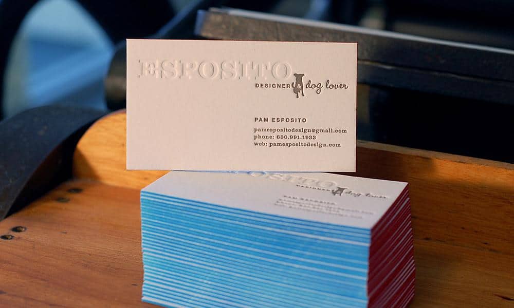
Despite the business world’s transition towards digital marketing, business cards have remained the most effective direct marketing tool.
Your business card is often the first impression people have of your company. You want to make that experience memorable and evoke the emotions for which your branding is engineered. That’s why it’s important to implement a professional business card brand strategy before selecting a design.
Some information is an obvious must-have for your business card. Every card should include the employee name, company name, job title, and contact information like phone number and email. Additional information that is often included on business cards is website URL, social media links, and company slogan or mission statement.
Business cards function as more than just a medium for information sharing. There are also more subtle factors to consider when designing the right business card for your company. In this blog post, we’ll cover everything you need to know!
Include Your Logo and Keep It Consistent Across Platforms
Most companies prominently feature a logo on their business card, but many take the wrong approach. When your company logo is too large, it comes across as unprofessional. One technique that allows you to emphasize your logo without making it huge is to surround it with white space. This brings attention to the logo without hurting the card’s professional appearance.
Keep your logo and branding consistent. Customers expect marketing materials to be uniform, and the branding of your business card should match that of your website and social media accounts. Otherwise, you risk confusing customers and losing potential business. The font style and color scheme of the card should match the look and feel of your brand persona. When you’re consistent your company appears more credible and it also improves brand awareness.
When it comes to font style and color scheme, the card should match the look and feel of your brand identity. Consistency makes the company appear more credible and improves brand awareness. If your branding is not consistent, you risk confusing customers.
Quality Materials Are Worth the Additional Expense
It may be tempting to take the affordable route and use low-quality paper stock, or even try and print your own cards. However, this approach is penny wise, pound foolish. Not only does your business card create a lasting first impression, but the feel of the paper has an important sensory role in recollection. Cheap card stock can make your business appear unprofessional.
The type of material you ultimately use for your business cards depends on the image your company wants to convey. For instance, a more traditional company seeking to send a message of reliability should use a substantial paper stock. A tech company looking to showcase their creativity should takea more unique approach with the materials used.
Your Design Should Account for the Manufacturer’s Cutting Margin of Error
While you can design your own business card, the manufacturing will be done by an outside party. It’s unrealistic to expect thousands of business cards will be cut perfectly every time. Avoid intricate border designs, especially those that lack an appropriate bleed area and safety line.
Bleed area refers to the outer part of the card that’s likely to be cut off. The area between the safety line and the edge of the card can be affected by cutting mistakes. Keep any text or important information within the safety line. Otherwise, it may get cut off during the manufacturing process.
What To Avoid When Designing a Business Card
There are also many things to avoid when implementing your business card brand strategy. These mistakes, such as overloading a card with graphics or color, can result in confusion, hurt your company’s branding, and even alienate potential customers.
Avoid going overboard with your business card design. Unnecessary elements not only hurt the impact your card has on people, it drives up costs. Tie your branding to a few colors, with at least one of them being in your logo. The most important factor in memory recall is color and a card with too many colors will distract and inhibit recollection.
It’s also smart to stay away from one-size-fits-all templates even if it seems like an appealing, time-saving option. If the template wasn’t designed specifically for your logo and brand image, it’s most likely going to distract from your company’s branding.
QR codes were once quite common on business cards. When scanned on a mobile device, a QR code directs users to digital content such as a website or app. While they do have some use and function for a small niche of businesses, most companies should avoid adding a QR code.
The main problem with QR Codes is that most consumers don’t know what they are and two-thirds of those that do find them unhelpful. Plus, most mobile phones don’t come with a default QR scanner. QR codes don’t add much value to most business cards while cluttering the overall design and distracting from the brand image.
In Conclusion
When it comes to designing a business card, you need to make sure the important information (name, business name, contact info) is clearly printed and easy to read. It’s also critical to have your logo and a compelling color scheme in play to make your card as memorable as possible. Follow these guidelines and your cards are sure to be a hit.


